Christopher Jarzabek
UX & Visual Designer
Windows Website
Microsoft Corporation
2011 – 2012
Concept, IA, UX & Visual Design
Challenge
Complement the launch of Windows 8, Microsoft's revolutionary new operating system, with a website that takes an equally gigantic step forward in both visual and user experience design.
Solution
We started by simplifying the information architecture, reducing the site from 7 sections to just 4. Then, we created the first Microsoft Web-interpretation of the "Metro" design-language: all content is exposed and contextual, with emphasis on beautiful typography, strong hierarchy, vibrant colors, and positive imagery.
Result
In usability studies, participants responded strongly to how we organized the site's content, and were unanimously excited by our visual designs. Other Microsoft teams loved the designs, too; you can see our influence on the new Microsoft.com, Surface.com, and WindowsPhone.com websites.
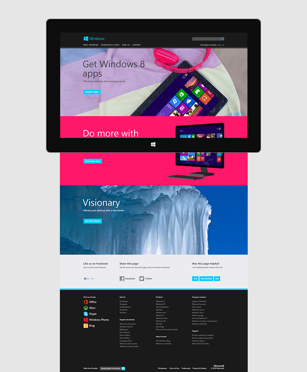
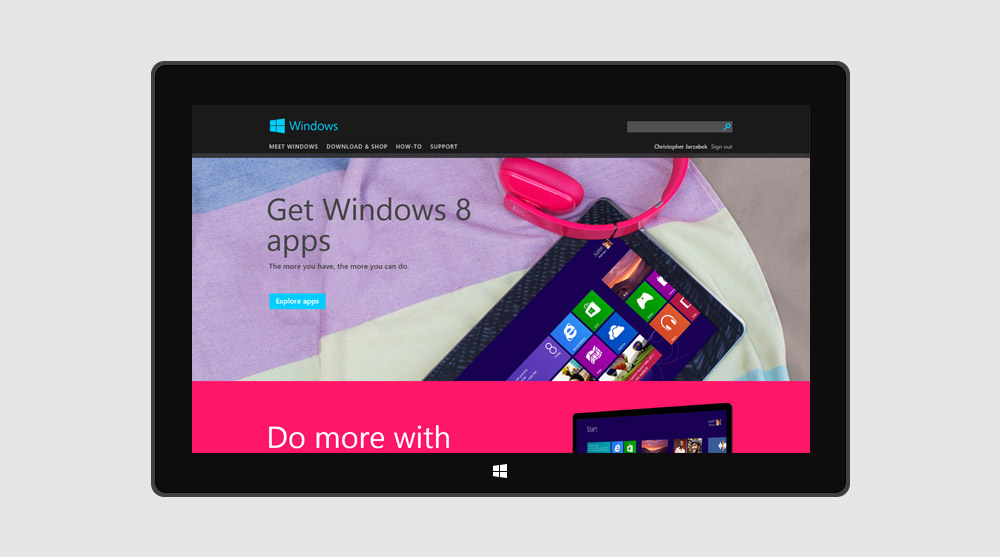
Homepage with unfolding hero elements
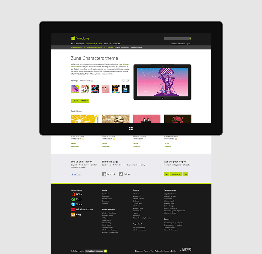
Theme page with interactive content
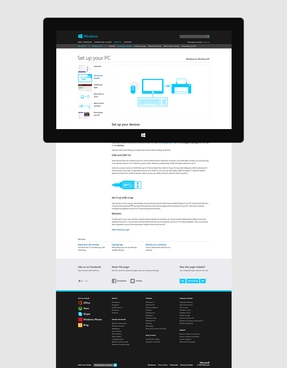
How-to article
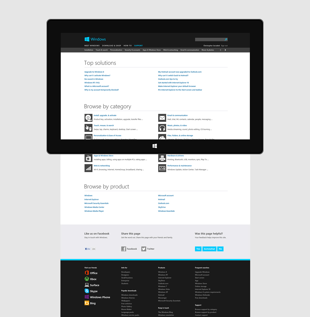
Support landing page
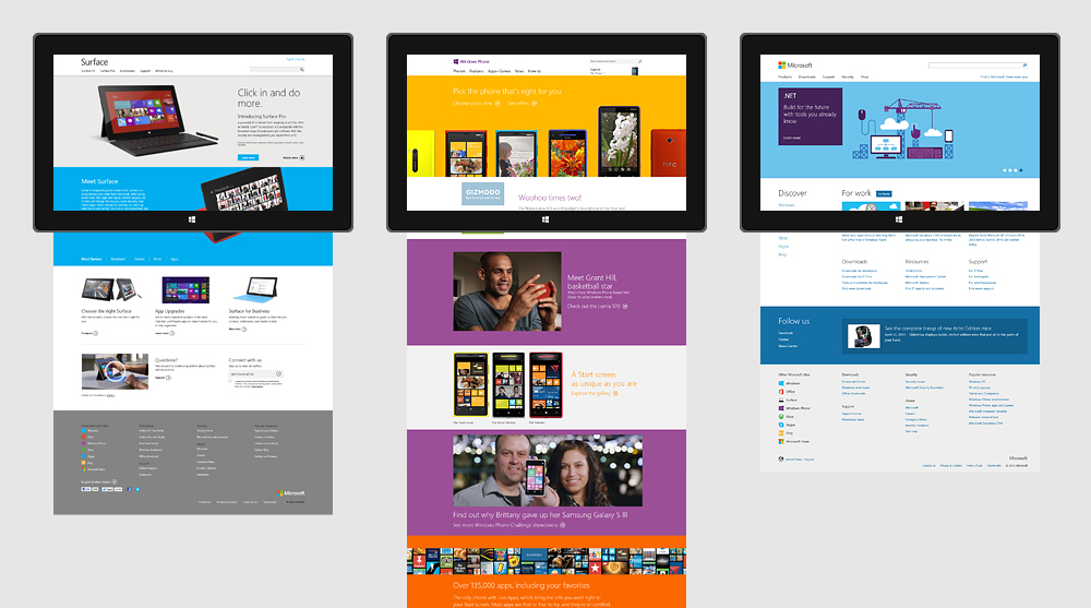
Our influence on the Surface, Windows Phone, and Microsoft homepages