Christopher Jarzabek
UX & Visual Designer
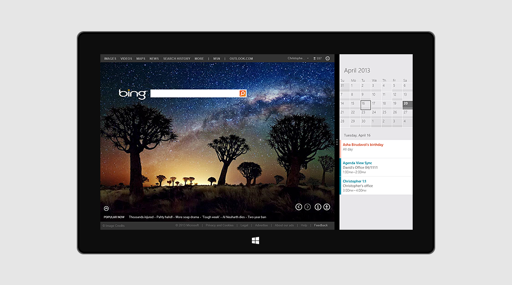
Calendar App
Microsoft Corporation
2012 – 2013
UX & Visual Design
Challenge
In the middle of a product-cycle, quickly stop and react to public feedback regarding the limited design and functionality of the initial Calendar app, satisfying users until the next big update is released.
Solution
Although the original design with calendar events as color-blocks was aesthetically pleasing, it was difficult to parse. So, I designed a system that was still attractive and modern, but much easier to scan. Other additions to this minor-update included Scheduling Assistant, a tool to help you identify when attendees are free, and a focused Work-week View.
Result
Reviews positively commented on all the improvements we made, calling particular attention to the event-block design changes, and the addition of the patented Time Indicator, which makes it easier to see exactly where you are in the day/week.
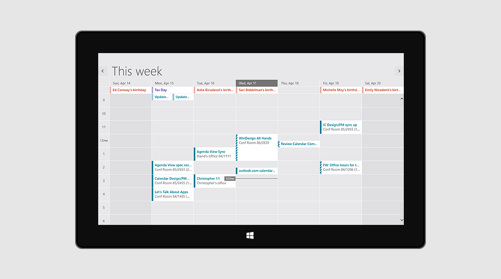
Week-view with patented time indicator
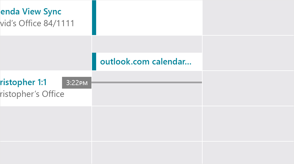
Patented time-indicator showing exact time and position in the day
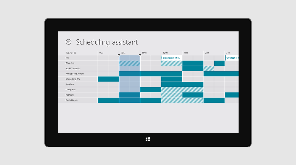
Scheduling Assistant helps users find the best time to setup a meeting
Improved Snap-view makes multi-tasking better than ever
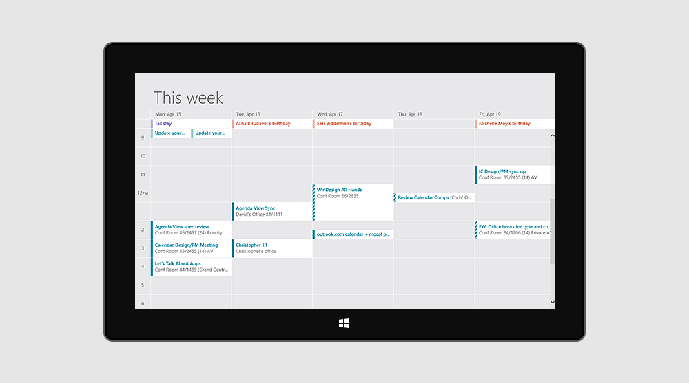
New view, which sheds the weekend and focuses on work